
|
Under HTML 4, everything to do with lay-out has to go into separate styles. There are three ways to combine HTML and styles. You can load an external style sheet, you can include a STYLE element inside the HEAD element of your document or you can use a STYLE attribute with tags in the body of your document. You can also combine the three methods in one document. This chapter first shows the 3 ways to include style information and then gives examples of what you can do with it.
Using an external style sheet has clear advantages. A whole series of HTML documents can use the same style sheet, for example all the chapters of this guide use the same style sheet. That means that changing an element of the lay-out no longer involves opening, editing and uploading a whole bunch of HTML files, but just changing one line in one style sheet.
For the moment, the disadvantage of style sheets is that only Explorer 3 and 4 and Netscape 4 support style sheets. Theoretically. In practice there are still many incompatibilities. Users of other and older browsers cannot benefit from the lay-out you put in a style sheet. If you have different browsers and use them to look at this chapter, you will probably see that not all examples work in all browsers.
A style sheet consists of a collections of rules. A rule consists of a declaration and its selector. For example:
TD.pinky {background:pink;}>
This is a rule which consists of the declaration background:pink and its selector TD.pinky. A rule can have more than one declaration defining, for example, text colour, background, border, alignment, etc. You can apply this rule by using, for example:
<TABLE><TR><TD CLASS=pinky>
EXAMPLE
</TD></TR></TABLE>
| EXAMPLE |
The CLASS element tells that this TD tag should use the TD.pinky rule. You can define different rules for the TD tag and use the CLASS element to decide which one to apply where. Alternatively you can use the ID attribute to select a style:
<P ID=yellowgreen>Ugly: yellow text on a green background.
Which refers to an entry in the style sheet like you have seen above:
#yellowgreen {color:yellow; align:center; background:green;}
The result is this:
Ugly: yellow text on a green background.
The difference between CLASS and ID is that an ID needs to be unique in a document. It can only occur once. A class can used as often as necessary.
Every HTML document that uses your style sheets needs a LINK element in this way:
<HTML><HEAD>
<LINK HREF=htmlguide.css REL="style sheet" TYPE=text/css>
...
...
</HEAD>
A style sheet is a simple plain text file that can be produced in any text editor or word processor if you save the file as plain text. An HTML document can use more than one style sheet. For example, this page uses the general style sheet for my HTML guide and an extra style sheet for the examples used here. The style sheet file contains declarations of the type used in the examples above.
You can also use styles in your HTML document by putting a STYLE element inside the header. Here is an example:
<HEAD>
<STYLE TYPE=text/css><!--
H1.green { color:green; align:center;}
--></STYLE>
</HEAD>
<H1 CLASS=green>Testcase</H1>
The comments are used in this example to hide the style rule from browsers that do not recognise the STYLE element (and will therefore ignore it). In this type of style definition you can use all the various options explained below. The examples below mostly use an external style sheet, but they are easy enough to adapt.
Using a style attribute is much like the other examples you have seen.
<P STYLE="color:maroon; align:center;">A Maroon Paragraph
A Maroon Paragraph
Again, you can use any of the styles explained below in a style attribute. You can also use the SPAN tag for a STYLE attribute. The SPAN tag's only function is as a placeholder for a STYLE attribute. It serves no other purpose.
<SPAN STYLE=color:maroon;>Maroon coloured text</SPAN>
In the rest of this chapter you will see more examples of the use of the SPAN tag.
The formatting model consist of four 'boxes':
- the contents;
- around that, the padding;
- around that, the borders;
- around that, the margins.
So this is more or less how it looks:
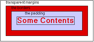
The content in this example is a bit of text but it can equally be other things such as a graphic or a table. the following sections will deal with foreground and background colour of the content and after that the padding, borders and margins.
To set the background color for your whole document put this line in your style sheet:
BODY {background:pink;}
This will give your page a pink background. The colour codes are the same ones you have seen in many other examples. You can use the background declaration for any element, for example, P, H1, etc. Here is an example with the P tag:
<P STYLE="background:gray; align:center;">This is a grey background
This is a grey background
The background you set affects the contents as well as the padding as shown in the formatting model above.
Style sheets allow you to use a background image not only with the body tag, meaning the whole document, but with basically any tag. You can put an image behind one paragraph of text:
<P STYLE="background: url(html4.gif) no-repeat white;">Semper ubi ... periculo deicerentur.
Semper ubi sub ubi. Quone modo nunc, fulve bos? Si hoc non legere potes, tu asinus es. Tua mater tam antiqua ut linguam latinam loquatur. Itaque cum adpropinquarent Britanniae et ex castris viderentur, tanta tempestas subito coorta est ut nulla earum cursum tenere posset, sed aliae eodem unde erant profectae referrentur, aliae ad inferiorem partem insulae, quae est propius solis occasum, magno suo cum periculo deicerentur.
The background colour white as specified above is used for those parts of the background that are not covered by the image. By default the image is positioned in the top left corner. You can change this:
<P STYLE="background: url(html4.gif) no-repeat bottom right white;">Semper ubi ... periculo deicerentur.
Semper ubi sub ubi. Quone modo nunc, fulve bos? Si hoc non legere potes, tu asinus es. Tua mater tam antiqua ut linguam latinam loquatur. Itaque cum adpropinquarent Britanniae et ex castris viderentur, tanta tempestas subito coorta est ut nulla earum cursum tenere posset, sed aliae eodem unde erant profectae referrentur, aliae ad inferiorem partem insulae, quae est propius solis occasum, magno suo cum periculo deicerentur.
The no-repeat keyword means that the image is shown only once. If you use repeat instead the image is shown multiple times to cover the whole background. You can also use repeat-y to repeat the image only along the vertical axis or repeat-x to repeat it only along the horizontal axis.
<P STYLE="background: url(html4.gif) repeat white;">Semper ubi ... periculo deicerentur.
<P STYLE="background: url(html4.gif) repeat-y white; width:300;">Semper ubi ... periculo deicerentur.
<P STYLE="background: url(html4.gif) repeat-x white;">Semper ubi ... periculo deicerentur.
Semper ubi sub ubi. Quone modo nunc, fulve bos? Si hoc non legere potes, tu asinus es. Tua mater tam antiqua ut linguam latinam loquatur. Itaque cum adpropinquarent Britanniae et ex castris viderentur, tanta tempestas subito coorta est ut nulla earum cursum tenere posset, sed aliae eodem unde erant profectae referrentur, aliae ad inferiorem partem insulae, quae est propius solis occasum, magno suo cum periculo deicerentur.
Semper ubi sub ubi. Quone modo nunc, fulve bos? Si hoc non legere potes, tu asinus es. Tua mater tam antiqua ut linguam latinam loquatur. Itaque cum adpropinquarent Britanniae et ex castris viderentur, tanta tempestas subito coorta est ut nulla earum cursum tenere posset, sed aliae eodem unde erant profectae referrentur, aliae ad inferiorem partem insulae, quae est propius solis occasum, magno suo cum periculo deicerentur.
Semper ubi sub ubi. Quone modo nunc, fulve bos? Si hoc non legere potes, tu asinus es. Tua mater tam antiqua ut linguam latinam loquatur. Itaque cum adpropinquarent Britanniae et ex castris viderentur, tanta tempestas subito coorta est ut nulla earum cursum tenere posset, sed aliae eodem unde erant profectae referrentur, aliae ad inferiorem partem insulae, quae est propius solis occasum, magno suo cum periculo deicerentur.
If you use a background image with the body tag you can fix it, which means that the image stays in place when you scroll through the page:
<BODY STYLE="background: url(html4.gif) no-repeat white fixed;">
This means that the html4.gif image will stay in the top left corner of the window, even when you scroll down through the text.
In a very identical way, you can set the foreground colour. In your external style sheet you include these two lines:
P.first {color:maroon; background:yellow; align:center;}
P.second {color:darkcyan; align:center;}
The colour codes should look familiar by know. In your HTML document you put:
<P CLASS=first>The First paragraph
<P CLASS=second>The Second Paragraph
The First paragraph
The Second Paragraph
You can see again the use of the CLASS element to select a style to go with a paragraph. It is easy to combine the background explained above with the colour.
If you want to set the same style, colour and width of border on all four sides of your element, the task is easy:
<P STYLE="border: dashed midnightblue thick; align:center;">Now hear this!
Now hear this!
For the colours you can use the usual standard names. For the size of the borders you can use thin, medium, thick, or a number. You can also set the attributes for each border separately. Here is another example:
<P STYLE="border-top-width:thin; border-right-width:thick; border-bottom-width:medium; border-left-width:medium; border-color:red; border-style: solid; align:center;">Different borders!
Different borders!
The same example can be achieved in a more compact way:
<P STYLE="border-width:thin thick medium medium; border-color:red; border-style: solid; align:center;">Different borders!
Different borders!
If you use one borderwidth attribute with 4 values, these will be applied to the top, right, bottom and left margins respectively. This is easy to remember: start at the top and go clockwise. You can also just specify two values in which case the first value will be applied to the top and bottom and the second value to the left and right borders. Here is an example doing just that but now with the colour:
<P STYLE="border-width:thick; border-color:red blue black green; border-style: solid; align:center;">Different colours!
Different colours!
If these examples do not look exactly as you expect them to on your screen than it may be that your browser does not support all aspects of style sheets. Particularly, older versions of Netscape are not very good in this.
As you can see in all the above examples, the border of the element is right around the contents. This is where padding comes in. It inserts space between the contents and the border:
<P STYLE="background:lavender; align:center; padding:5; border: thin solid black;">Some room to swing a cat
Some room to swing a cat
Padding can be set differently for top, right, bottom and left:
<P STYLE="background:lavender; align:center; padding-top:5; padding-right:50; padding-bottom:20; padding-left:20; border: thin solid black;">Different room to swing a cat
Different room to swing a cat
Or again in a shorter way, similar to the thing with the borders.
<P STYLE="background:lavender; align:center; padding:5 20 20 20; border: thin solid black;">Different room to swing a cat
Different room to swing a cat
What you can also see in this example is how the background fills not only the element but also fills the space created by the padding.
The margins can be set in much the same way as the borders. The margins are transparent space around your object, to keep it away from surrounding text and images or, in this case, the border I draw around all the examples in this guide.
<P STYLE="background:lavender; align:center; margin-top:5; margin-right:50; margin-bottom:5; margin-left:50;">Clear The Margins!
<P STYLE="background:lavender; align:center; margin:5 100 5 100;">Clear The Margins More!
Which results in:
Clear The Margins!
Clear The Margins More!
Again you can see the two different ways of specifying the four margins for top, right, bottom and left side.
You can set the font family for any element in two ways, either by choosing a generic font family of specifying an exact font name. The following generic families are available:
Using a generic font family enables the browser to find something that comes close. You can combine the two possibilities. Include, for example, this in your external style sheet:
P.font1 { font-family:times,times new roman,serif; align:center;}
P.font2 { font-family:helvetica,sans-serif; align:center;}
P.font3 { font-family:courier,profont,monospace; align:center;}
Now in your HTML document you can use:
<P CLASS=font1>First Example
<P CLASS=font2>Second Example
<P CLASS=font3>Third Example
First Example
Second Example
Third Example
The browser will first try to find the font you specify, for example courier and profont and if it cannot find those use a generic monospace font depending on what is available.
Font-weight is used to specify the weight of the font, creating lighter or darker version of the normal font.
<SPAN STYLE=font-weight:lighter;>A lighter line</SPAN>
<SPAN STYLE=font-weight:light;>A light line</SPAN>
<SPAN STYLE=font-weight:normal;>A normal line</SPAN>
<SPAN STYLE=font-weight:bold;>A bold line</SPAN>
<SPAN STYLE=font-weight:bolder;>A bolder line</SPAN>
A lighter line
A light line
A normal line
A bold line
A bolder line
In the example above you can also see the use of the SPAN tag. It serves no purpose except as a placeholder for STYLE or CLASS attributes. Alternatively you can use a numerical value as in the example below. Partial values such as 250 are not accepted. You should note that 400 is the same as normal and 700 is the same as bold.
<SPAN STYLE=font-weight:100;>Gradient Weight 100</SPAN>
<SPAN STYLE=font-weight:200;>Gradient Weight 200</SPAN>
<SPAN STYLE=font-weight:300;>Gradient Weight 300</SPAN>
<SPAN STYLE=font-weight:400;>Gradient Weight 400 (normal)</SPAN>
<SPAN STYLE=font-weight:500;>Gradient Weight 500</SPAN>
<SPAN STYLE=font-weight:600;>Gradient Weight 600</SPAN>
<SPAN STYLE=font-weight:700;>Gradient Weight 700 (bold)</SPAN>
<SPAN STYLE=font-weight:800;>Gradient Weight 800</SPAN>
<SPAN STYLE=font-weight:900;>Gradient Weight 900</SPAN>
Gradient Weight 100
Gradient Weight 200
Gradient Weight 300
Gradient Weight 400 (normal)
Gradient Weight 500
Gradient Weight 600
Gradient Weight 700 (bold)
Gradient Weight 800
Gradient Weight 900
As you can see, not all the different gradient weights actually appear different on the screen. This depends on the font in use, not all font families have the full range of weights available.
There are three styles available: normal, italic and oblique. You cannot apply more than one value at the same time.
<SPAN STYLE=font-style:italic;>Italic Text</SPAN>
<SPAN STYLE=font-style:normal;>Normal Text</SPAN>
<SPAN STYLE=font-style:oblique;>Oblique Text</SPAN>
Italic Text
Normal Text
Oblique Text
If and how exactly the three styles display depends on the fonts that are available to the browser.
Font-variant can be used only to swap between normal and small-caps fonts.
<SPAN STYLE=font-variant:small-caps;>Small-caps font</SPAN>
<SPAN STYLE=font-variant:normal;>Normal font</SPAN>
Small-caps font
Normal font
You only need the use the normal value if an element has inherited a small-caps setting from its parent and you wish to use a normal font.
There are different ways of defining font sizes. The first one is by using absolute sizes. How large these sizes actually look on the screen may vary depending on the font family in use.
<SPAN STYLE=font-size:xx-small;>Extra, extra small text</SPAN>
<SPAN STYLE=font-size:x-small;>Extra small text</SPAN>
<SPAN STYLE=font-size:small;>Small text</SPAN>
<SPAN STYLE=font-size:medium;>Medium (default) text</SPAN>
<SPAN STYLE=font-size:large;>Large text</SPAN>
<SPAN STYLE=font-size:x-large;>Extra large text</SPAN>
<SPAN STYLE=font-size:xx-large;>Extra, extra large text</SPAN>
Extra, extra small text
Extra small text
Small text
Medium text
Large text
Extra large text
Extra, extra large text
You may have already noticed that the same font size displays different on, for example, Macintosh and Windows. In the Javascript chapter you can learn how to load different stylesheets for different platforms to deal with this. The second way of defining font size is relative to the size of the parent, the surrounding object.
<P STYLE=font-size:large;>This is an example of <SPAN STYLE=font-size:smaller;>smaller</SPAN> and <SPAN STYLE=font-size:larger;>larger</SPAN>.
This is an example of smaller and larger.
In the above example the paragraph has a large font, and the words smaller and larger get a relative size. If you compare this example to the previous one you can see that smaller relative to large results in medium and larger relative to large results in x-large.
You can also set the font-size in absolute terms in millimeters, centimeters, inches, point, pixel, pica, x-height (the height of the font's lowercase letter x) or em (the height of the font).Obviously font sizes cannot be negative.
<SPAN STYLE=font-size:6mm;>6 Millimeter</SPAN>
<SPAN STYLE=font-size:1cm;>1 Centimeter</SPAN>
<SPAN STYLE=font-size:0.5in;>0.5 Inches</SPAN>
<SPAN STYLE=font-size:12pt;>12 Points (12/72 of an inch)</SPAN>
<SPAN STYLE=font-size:14px;>14 Pixels</SPAN>
<SPAN STYLE=font-size:2pc;>2 Pica (24 points)</SPAN>
<SPAN STYLE=font-size:2ex;>2 x-height of the parent</SPAN>
<SPAN STYLE=font-size:0.5em;>0.5 em of the parent</SPAN>
6 Millimeter
1 Centimeter
0.5 Inches
12 Points (12/72 of an inch)
14 Pixels
2 Pica (24 points)
2 x-height of the parent
0.5 em of the parent
Finally, you can set the font size as a percentage of the font size of the parent.
<P STYLE=font-size:large;>This is an example of <SPAN STYLE=font-size:50%;>fifty percent</SPAN> and <SPAN STYLE=font-size:150%;>hundredfifty percent</SPAN>.
This is an example of fifty percent and hundredfifty percent.
Style sheets allow you to control the distance between the characters in a word. The distance can be set in millimeters, centimeters, inches, points, pixels, picas, ex and em, just like the font sizes above.
<SPAN STYLE=letter-spacing:2mm>2 millimeters</SPAN>
<SPAN STYLE=letter-spacing:0.5cm>0.5 centimeter</SPAN>
<SPAN STYLE=letter-spacing:0.5in>0.5 inch</SPAN>
<SPAN STYLE=letter-spacing:3pt>3 points</SPAN>
<SPAN STYLE=letter-spacing:3px>3 pixels</SPAN>
<SPAN STYLE=letter-spacing:1pc>1 pica</SPAN>
<SPAN STYLE=letter-spacing:0.5ex>0.5 x-height</SPAN>
<SPAN STYLE=letter-spacing:0.5em>0.5 font height</SPAN>
2 millimeters
0.5 centimeter
0.5 inch
3 points
3 pixels
1 pica
0.5 x-height
0.5 font height
As you can see a very large letter spacing doesn't necessarily make your text very readable. The value normal can be used to set the letter spacing back to the default for whatever font you are using if a different value was inherited from a parent element.
<P STYLE=letter-spacing:0.5cm>Large and <SPAN STYLE=letter-spacing:normal>normal</SPAN> spacing.
Large and normal spacing.
This property can be used to set the distance between two lines of text, also called leading. The value can be set as a number, which sets the distance between lines to the font size multiplied by that number.
<P STYLE=line-height:2;>Semper ubi sub ubi ... periculo deicerentur.
Semper ubi sub ubi. Quone modo nunc, fulve bos? Si hoc non legere potes, tu asinus es. Tua mater tam antiqua ut linguam latinam loquatur. Itaque cum adpropinquarent Britanniae et ex castris viderentur, tanta tempestas subito coorta est ut nulla earum cursum tenere posset, sed aliae eodem unde erant profectae referrentur, aliae ad inferiorem partem insulae, quae est propius solis occasum, magno suo cum periculo deicerentur.
The value for line-height can also be set in millimeters, centimeters, inches, points, pixels, picas, ex and em, just like the font sizes and letter spacing above. Because these examples take up so much space, I will give only one.
<P STYLE=line-height:8mm;>Semper ubi sub ubi ... periculo deicerentur.
Semper ubi sub ubi. Quone modo nunc, fulve bos? Si hoc non legere potes, tu asinus es. Tua mater tam antiqua ut linguam latinam loquatur. Itaque cum adpropinquarent Britanniae et ex castris viderentur, tanta tempestas subito coorta est ut nulla earum cursum tenere posset, sed aliae eodem unde erant profectae referrentur, aliae ad inferiorem partem insulae, quae est propius solis occasum, magno suo cum periculo deicerentur.
You can also use a negative number for line-height, which will create overlapping text. You can also use a percentage for line-height, this will create a line distance as a percentage of the font size.
The text-align property is used to specify the alignment of text. It can have one of four values: left, right, center or justify.
<P STYLE=text-align:left>Left aligned text
<P STYLE=text-align:center>Centered text
<P STYLE=text-align:right>Right aligned text
<P STYLE=text-align:justify>Semper ubi ... periculo deicerentur.
Left aligned text
Centered text
Right aligned text
Semper ubi sub ubi. Quone modo nunc, fulve bos? Si hoc non legere potes, tu asinus es. Tua mater tam antiqua ut linguam latinam loquatur. Itaque cum adpropinquarent Britanniae et ex castris viderentur, tanta tempestas subito coorta est ut nulla earum cursum tenere posset, sed aliae eodem unde erant profectae referrentur, aliae ad inferiorem partem insulae, quae est propius solis occasum, magno suo cum periculo deicerentur.
|
This is what the style sheet for this guide says about colours for links:
A:link {color:black;}
A:visited {color:black;}
A:active {color:red;}
A:hover {color:midnightblue;}
The first three lines define the text colour for a link, for a link that has been visited recently (whereby recently depends on preferences set in the browser) and an active link respectively. A link is active if you put the mouse pointer over it an keep the (left) button down. The fourth line is what happens to a link if the mouse pointer is hovering over it, without the button being down. As far as I have seen it only works in Explorer 4. You can use any sort of style, font and font weight for these rules, but your browser is not obliged to reformat the page after every link you visited or each time you hover over a link.
If you want to use different link styles on your pages you can put something like this in your style sheet:
A:link.one {color:black; font-family:sans-serif; font-style:italic;}
A:link.two {color:green; font-family:serif; font-weight:bold;}
A:link.three {color:red; font-family:monospace; text-decoration:none;}
In your HTML document you define the links like this:
<P><A HREF=xxx.html CLASS=one>non-existent file</A><BR>
<A HREF=yyy.html CLASS=two>another non-existent file</A><BR>
<A HREF=zzz.html CLASS=three>the last non-existent file</A>
The result is:
non-existent file
another non-existent file
the last non-existent file
Some browsers, however, get very confused if you try to set different link styles within one document. You can work your way around this buy using a STYLE attribute in every A tag.
<A HREF=xxx.html STYLE="color:black; font-family:sans-serif; font-style:italic;">non-existent file</A>
<A HREF=yyy.html STYLE="color:green; font-family:serif; font-weight:bold;">another non-existent file</A>
<A HREF=zzz.html STYLE="color:red; font-family:monospace; text-decoration:none;">the last non-existent file</A>
non-existent file
another non-existent file
the last non-existent file
Style Sheets can be used to force a page break at a certain point when printing. This is how the title of this section is done:
<H2 CLASS=myheader2 STYLE=page-break-before:always;>Forcing a Page Break</H2>
If you look at "print preview" in your browser or print this document you will see that this section always starts on a new page. You can also force a page break after a paragraph or a header. The following will result in another page break at the end of this section:
<P STYLE=page-break-after:always;>Break again after this paragraph...
Break again after this paragraph...
You should be aware, however, that not all browsers support this way of forcing a page break when printing.
|